First Impressions
Brand Kit
Everything you need to talk about
First Impressions
Logo
The First Impressions logo features a distinct upsidedown triangle, symbolizing a fresh perspective. With in the triangle are the initials "F" and "I" standing for First Impressions.
The sharp lines of the logo represent precision and professionalism, while the geometric form conveys strength and stability.


Alternative Logo
The First Impressions Powered by Text In Church logo offersa unified, professional expression of the partnership,combining the signature mark with a clean typographicsystem that communicates clarity and trust.It’s horizontal layout ensures strong readability across digitaland print environments, while the supporting line “Powered by Text In Church” reinforces the connection to the platformthat equips churches with practical tools for guest follow‑up.

Academy Logo
The First Impressions Academy logo presents a clear, structured expression of the brand, combining the signature mark with a refined typographic system that communicates professionalism and trust.
It's horizontal layout ensures strong readability across digital and print environments, while the supporting “Academy” text anchors the logo in its educational purpose. Designed for versatility, the logo maintains visual balance on all approved background colors and reinforces the Academy’s mission to equip churches with practical, system‑driven training that helps guests feel known from the moment they arrive.
Colors
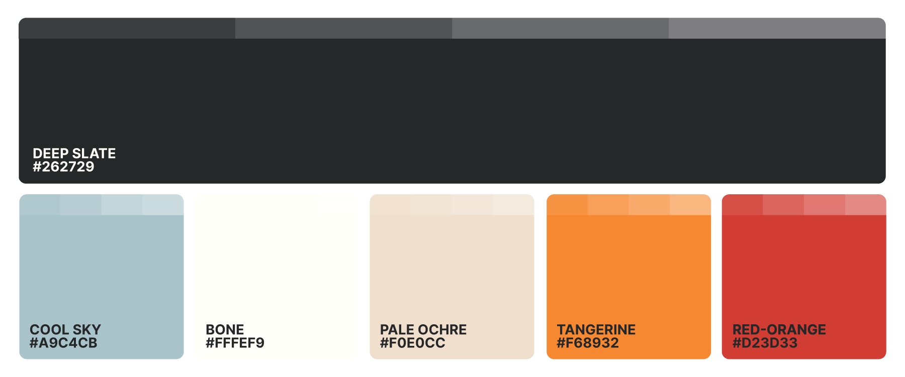
The First Impressions brand colors combine deep slate, soft neutrals, and warm accent tones to create a balanced, welcoming visual identity. Cool Sky, Bone, and Pale Ochre provide calm, approachable foundations, while Tangerine and Red‑Orange introduce energy and movement that highlight key moments across the brand. Together, this palette supports clarity, warmth, and consistency in every application, helping First Impressions communicate hospitality with confidence and intention.
Typography
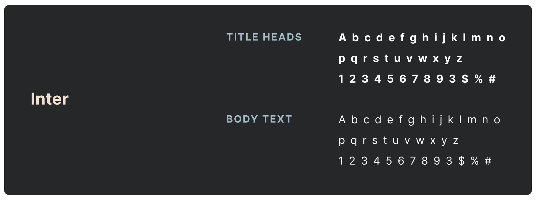
We use Inter for headlines and body copy. It is licensed font.
Reach out to Rachel Pedersen (rachel.pedersen@textinchurch.com) if you need access for an approved project.
Photography
The First Impressions photography style captures authentic, people‑centered moments that reflect warmth, hospitality, and genuine connection. Images should feel natural and unstaged, highlighting volunteers, guests, and environments in ways that communicate approachability and clarity. Clean lighting, balanced composition, and consistent tonal treatments ensure a cohesive visual atmosphere across all platforms, reinforcing the brand’s mission to help every guest feel known from the moment they arrive.

Need The Full Kit?


